|
|
 Get the latest Java books |
|
|
h t t p : / /w w w . j a v a c o f f e e b r e a k . c
o m /
|
||
New to Java? We'll help you get started with our revised beginner's tutorial, or our free online textbook.
|
|
Get the latest Java books |
|
|
h t t p : / /w w w . j a v a c o f f e e b r e a k . c
o m /
|
||
Section 7.3
Standard Components and Their Events
THIS SECTION DISCUSSES some of the GUI interface elements that are represented by subclasses of Component. It also introduces the event classes and listener interfaces associated with each type of component. The treatment here is very brief. I will give some examples of programming with these components in the next section.
The Component class itself defines many useful methods that can be used with components of any type. We've already used some of these in examples. Let comp be a variable that refers to any component. Then the following methods are available (among many others):
- comp.getSize() is a function that returns an object belonging to the class Dimension. This object contains two instance variables, comp.getSize().width and comp.getSize().height, that give the current size of the component. One warning: When a component is first created, its size is zero. The size will be set later, probably by a layout manager. A common mistake is to check the size of a component before that size has been set.
- comp.getParent() is a function that returns a value of type Container. The container is the one that contains the component, if any. For a top-level component such as a Window or Applet, the value will be null.
- comp.getLocation() is a function that returns the location of the top-left corner of the component. The location is specified in the coordinate system of the component's parent. The returned value is an object of type Point. An object of type Point contains two instance variables, x and y.
- comp.setEnabled(true) and comp.setEnabled(false) can be used to enable and disable the component. This is only useful for certain types of components, such as button. When a button is disabled, its appearance changes, and clicking on it will have no effect. There is a boolean-valued function, comp.getEnabled() that you can call to discover whether the component is enabled.
- comp.setVisible(true) and comp.setVisible(false) can be called to hide or show the component.
- comp.setBackground(color) and comp.setForeground(color) set the background and foreground colors for the component. If no colors are set for a component, it inherits the colors of its parent container. The command comp.setFont(font) sets the default font that is used for text displayed on the component. (These should work for all components, but might not work properly for some of the standard components, depending on the version of Java.)
There is also an event type associated with components. Whenever a component is hidden, shown, moved, or resized, an event belonging to the class ComponentEvent is generated. These events are handled in the same way as the mouse and keyboard events that we saw in the previous chapter: If you want to listen for a ComponentEvent, you have to implement the ComponentListener interface. This interface defines four methods:
         public void componentResized(ComponentEvent evt);
         public void componentMoved(ComponentEvent evt);
         public void componentHidden(ComponentEvent evt);
         public void componentShown(ComponentEvent evt);
Once you have an object that implements this interface, you must register it with a component by calling the component's addComponentListener() method. The parameter, evt, contains a function, evt.getComponent(), that returns the Component that generated the event. From this interface, you are most likely to use the componentResized() method, which is useful when you want to take some action each time the size of a component is changed.
For the rest of this section, we'll look at subclasses of Component that represent common GUI components. Remember that using any component is a multi-step process. The component object must be created with a constructor. It must be added to a container. In many cases, a listener must be registered to respond to events from the component. And in some cases, a reference to the component must be saved in an instance variable so that the component can be manipulated by the program after it has been created.
Here is a simple applet that demonstrates several of the components discussed in this section. Across the top are a Choice menu, a Checkbox, and a TextField. The rest of the applet shows a large canvas with ScrollBars below and to the right. The scroll bars control the color of the display. If you type in the TextField and press return, the text you typed will be displayed on the canvas.
Although this is a rather silly example, it does show how to create and use several types of components. You'll find the source code for this example in the file EventDemo.java.
The Button Class
An object of class Button is a push button. You've already seen buttons used in the previous chapter, but we can use a review of Buttons as a reminder of what's involved in using components, events, and listeners. (Some of the methods described here are new.)
- Constructors: The Button class has a constructor that takes a string as a parameter. This string becomes the label displayed on the button. For example: stopGoButton = new Button("Go")
- Events: When the user clicks on a button, the button generates an event of type ActionEvent. This event is sent to any listener that has been registered with the button.
- Listeners: An object that wants to handle events generated by buttons must implement the ActionListener interface. This interface defines just one method, "pubic void actionPerformed(ActionEvent evt)", which is called to notify the object of an action event.
- Registration of Listeners: In order to actually receive notification of an event from a button, an ActionListener must be registered with the button. This is done with the button's addActionListener() method. For example: stopGoButton.addActionListener(buttonHandler)
- Event methods: When actionPerformed(evt) is called by the button, the parameter, evt, contains information about the event. This information can be retrieved by calling methods in the ActionEvent class. In particular, evt.getActionCommand() returns a String giving the command associated with the button. By default, this command is the label that is displayed on the button.
- Component methods: There are several useful methods in the Button class. For example, stopGoButton.setLabel("Stop") changes the label displayed on the button to "Stop". And stopGoButton.setActionCommand("sgb") changes the action command associated to this button for action events.
Of course, Buttons also have all the general Component methods, such as setEnabled() and setFont(). The setEnabled() and setLabel() methods of a button are particularly useful for giving the user information about what is going on in the program. A disabled button is better than a button that gives an obnoxious error message such as "Sorry, you can't click on me now!"
The Label Class
Labels are certainly the simplest type of component. An object of type Label is just a single line of text. The text cannot be edited by the user, although it can be changed by your program. The constructor for a Label specifies the text to be displayed:
Label message = new Label("Hello World!");
There is another constructor that specifies where in the label the text is located, if there is extra space. The possible alignments are given by the constants Label.LEFT, Label.CENTER, and Label.RIGHT. For example,
Label message = new Label("Hello World!", Label.CENTER);
creates a label whose text is centered in the available space. You can change the text displayed in a label by calling the label's setText() method:
message.setText("Goodby World!");
Since the Label class is a subclass of Component, you can use methods such as setForeground() with labels. For example:
      Label message = New Label("Hello World!");
      message.setForeground(Color.red);   // display red text...
      message.setBackground(Color.black); //    on a black background...
      message.setFont(new Font("Serif", Font.BOLD, 18));  // in a bold font
The Checkbox and CheckboxGroup Classes
A Checkbox is a component that has two states: checked and unchecked. The user can change the state of a check box by clicking on it. The state of a checkbox is represented by a boolean value that is true if the box is checked and false if the box is unchecked. A checkbox has a label, which is specified when the box is constructed
Checkbox showTime = new Checkbox("Show Current Time");
Usually, it's the user who sets the state of a Checkbox, but you can also set the state in your program. The current state of a checkbox is set using its setState(boolean) method. For example, if you want the checkbox showTime to be checked, you would say "showTime.setState(true);". To uncheck the box, say "showTime.setState(false);". You can determine the current state of a checkbox by calling its getState() method, which returns a boolean value.
In many cases, you don't need to worry about events from checkboxes. Your program can just check the state whenever it needs to know it by calling the getState() method. However, a checkbox does generate an event when its state changes, and you can detect this event and respond to it if you want something to happen at the moment the state changes. When the state of a checkbox is changed, it generates an event of type ItemEvent. The associated listener interface is ItemListener. To receive notification of item events from a checkbox, an object must implement the ItemListener interface and it must be registered with the checkbox by calling its addItemListener() method. The ItemListener interface defines one method, "public void itemStateChanged(ItemEvent evt)".
For handling ItemEvents, I recommend calling evt.getSource() in the itemStateChanged() method to find out which object generated the event. (Of course, if you are only listening for events from one component, you don't even have to do this.) The getSource() method can be used with any event type, not just ItemEvents. The method evt.getSource() returns the object that generated the event. The returned value is of type Object, but you can type-cast it to another type if you want. Once you know the object that generated the event, you can ask the object to tell you its current state. For example, if you know that the event had to come from one of two checkboxes, cb1 or cb2, then your itemStateChanged() method might look like this:
          public void itemStateChanged(ItemEvent evt) {
             Object source = evt.getSource();
             if (source == cb1) {
                boolean newState = cb1.getState();
                ... // respond to the change of state
             }
             else if (source == cb2) {
                boolean newState = cb2.getState();
                ... // respond to the change of state
             }
          }
Closely related to checkboxes are radio buttons. Radio buttons occur in groups. At most one radio button in a group can be checked at any given time. In Java, a radio button is just an object of type Checkbox that is a member of such a group. An entire group of radio buttons is represented by an object belonging to the class CheckboxGroup. The class CheckBoxGroup has methods
            public void setSelectedCheckbox(Checkbox box);
            public Checkbox getSelectedCheckbox();
for selecting one of the checkboxes in the group, and for discovering which box is currently selected. The getSelectedCheckbox() method will return null if none of the boxes in the group is currently selected.
To create a group of radio buttons, you should first create an object of type CheckboxGroup. To create the individual buttons, use the constructor
Checkbox(String label, CheckboxGroup group, boolean state);The third parameter of this constructor specifies the initial state of the checkbox. Remember that at most one of the checkboxes in the group can have its state set to true. For example:
          CheckboxGroup colorGroup = new CheckboxGroup();
          Checkbox red   = new Checkbox("Red", colorGroup, false);
          Checkbox blue  = new Checkbox("Blue", colorGroup, false);
          Checkbox green = new Checkbox("Green", colorGroup, true);
          Checkbox black = new Checkbox("Black", colorGroup, false);
This creates a group of four radio buttons labeled "Red", "Blue", "Green", and "Black". Initially, the third button is selected. You still have to add the Checkboxes, individually, to some container. The CheckboxGroup itself is not a component and cannot be added to a container. To actually use the buttons effectively in your program, you would presumably want to store either the CheckboxGroup object or the individual Checkbox objects in instance variables. ItemEvents are generated by each individual Checkbox object when its state changes. Again, you can often ignore these events and simply ask the CheckboxGroup which Checkbox is selected, whenever you have a need to know. If you do want to respond to ItemEvents, you need to register your listener with each of the Checkboxes individually.
The Choice Class
A CheckBoxGroup is one way of allowing the user to select one option from a predetermined set of options. The Choice class represents another way of doing the same thing. An object of type Choice, however, presents the options in the form of a menu. The menu lists a number of items. Only the selected item is displayed. However, when the user clicks on the Choice component, the entire list is displayed, and the user can select one of the items from the list. (There are three types of menus in Java: Choice menus, pop-up menus, and pull-down menus. Pop-up menus and pull-down menus are not Components. I'll discuss pop-up menus later in this section and pull-down menus in Section 7. In fact, Choice components are not technically considered to be menus, but it's hard to find another word that adequately describes what they do.)
When a Choice object is first constructed, it initially containes no items. An item is added to the bottom of the menu by calling its instance method, add(String). The getItemCount() method returns an int that gives the number of items in the list, and the method
public String getItem(int index)
gets the item in position number index in the list. (Items are numbered starting with zero, not one.) Other useful methods are:
          public int getSelectedIndex();
          public String getSelectedItem();
          public void select(int index);
          public void select(String itemName);
These methods serve the obvious purposes (noting that an item can be referred to either by its position in the list or by the actual text of the item).
For example, the following code will create an object of type Choice that contains the options Red, Blue, Green, and Black:
          Choice colorChoice = new Choice();
          colorChoice.add("Red");
          colorChoice.add("Blue");
          colorChoice.add("Green");
          colorChoice.add("Black");
The most common way to use a Choice menu is to call its getSelectedIndex() method when you have a need to know which item in the menu is currently selected. However, like Checkboxes, Choice components generate ItemEvents. You can register an itemListener with the Choice component if you want to respond to such events when they occur.
The List Class
An object of type List is very similar to a Choice object. However, a List is presented on the screen as a scrolling list of items. Furthermore, you can create a List in which it is possible for the user to select more than one item in the list at the same time. The constructor for a List object takes the form
List(int itemsVisible, boolean multipleSelectionsAllowed);The fist parameter tells how many items are visible in the list at one time; if the list contains more than this number of items, then the user can use a scroll bar to scroll through the list. The second parameter determines whether or not the user can select more than one item in the list at the same time. If you leave out the second parameter, multiple selections are not allowed.
The List class includes the add(String) method to add an item to the end of the list. You can also add an item in a specified position in the list using the add(String,int) method. (Items are numbered starting from zero.) The getItemCount() method returns an int giving the number of items in the list. The method remove(int) deletes the item at a specified position, while remove(String) removes a specified item. The select(int) method can be used to select the item at the specified position in the list, and deselect(int) unselects the item.
If exactly one item in the list is selected, then the method getSelectedIndex() will return the index of that item, and getSelectedItem() will return the item itself. However, if no items are selected or if more than one item is selected, then getSelectedIndex() will return -1, and getSelectedItem() will return null. In that case, you can use the methods getSelectedItems() and getSelectedIndexes() to determine which items are selected. (However, these two methods return "arrays", which I will not cover until Chapter 8.)
A List generates events of type ItemEvent, and you can register an ItemListener with a List if you want. An ItemEvent is generated whenever an item is selected. In the case of a list that allows multiple selections, an ItemEvent is also generated whenever an item is deselected. A List also generates an event of type ActionEvent when the user double-clicks on an item. The action command associated with such an ActionEvent is the text of the item on which the user double-clicked.
The TextField and TextArea Classes
TextFields and TextAreas are boxes where the user can type in and edit text. The difference between them is that a TextField contains a single line of editable text, while a TextArea displays multiple lines and might include scroll bars that the user can use to scroll through the entire contents of the TextArea. (It is also possible to set a TextField or TextArea to be read-only so that the user can read the text that it contains but cannot edit the text.)
Both TextField and TextArea are subclasses of TextComponent, which is itself a subclass of Component. The TextComponent class supports the idea of a selection. A selection is a subset of the characters in the TextComponent, including all the characters from some starting position to some ending position. The selection is hilited on the screen. The user selects text by dragging the mouse over it. Some useful methods in class TextComponent include the following. They can, of course, be used for both TextFields and TextAreas.
       public void setText(String newText);  // substitute newText
                                             //   for current contents
       public String getText();  // return a copy of the current contents
       public String getSelectedText();  // return the selected text
       public select(int start, int end);  // change the selected range;
           // characters in the range  start <= pos < end  are
           // selected; characters are numbered starting from zero
       public int getSelectionStart();  // get starting point of selection
       public int getSelectionEnd();  // get end point of selection
       public void setEditable(boolean canBeEdited);
          // specify whether or not the text in the component
          // can be edited by the user
The constructor for a TextField takes the form
TextField(int columns);where columns specifies the number of characters that should be visible in the text field. This is used to determine the width of the text field. (Because characters can be of different sizes, the number of characters visible in the text field might not be exactly equal to columns.) You don't have to specify the number of columns; for example, you might want the text field to expand to the maximum size available. In that case, you can use the constructor TextField(), with no parameters. You can also use the following constructors, which specify the initial contents of the text field:
         TextField(String contents);
         TextField(String contents, int columns);
The constructors for a TextArea are
         TextArea();
         TextArea(int lines, int columns);
         TextArea(String contents);
         TextArea(String contents, int lines, int columns);
The parameter lines specifies how many lines of text are visible in the text area. This determines the height of the text area. (The text area can actually contain any number of lines; a scroll bar is used to reveal lines that are not currently visible.) It is common to use a TextArea as the Center component of a BorderLayout. In that case, it isn't useful to specify the number of lines and columns, since the TextArea will expand to fill all the space available in the center area of the container.
The TextArea class adds a few useful procedures to those inherited from TextComponent:
         public void append(String text);
               // add the specified text at the end of the current
               // contents; line breaks can be inserted by using the
               // special character \n
         public void insert(String text, int pos);
               // insert the text, starting at specified position
         public void replaceRange(String text, int start, int end);
               // delete the text from position start to position end
               //    and then insert the specified text in its place
A TextField generates an ActionEvent when the user presses return while typing in the TextField. The TextField class includes an addActionListener() method that can be used to register a listener with a TextField. In the actionPerformed() method, the evt.getActionCommand() method will return a copy of the text from the TextField. TextAreas do not generate action events.
The ScrollBar Class
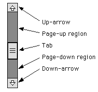
Finally, we come to the ScrollBar class. A ScrollBar allows the user to select an integer value from a range of values. A scroll bar can be either horizontal or vertical. It has five parts:
The position of the tab specifies the currently selected value. The user can move the tab by dragging it or by clicking on any of the other parts of the scroll bar. On some platforms, the size of the tab tells what portion of a scrolling region is currently visible. It is actually the position of the bottom or left edge of the tab that represents the currently selected value.
A scroll bar has four associated integer values:
- min, which specifies the starting point of the range of values represented by the scrollbar, corresponding to the left or bottom edge of the bar
- max, which specifies the end point of the range of values, corresponding to the right or top edge of the bar
- visible, which specifies the size of the tab
- value, which gives the currently selected value, somewhere in the range between min and (max - visible).
These values can be specified when the scroll bar is created. The constructor takes the form
Scrollbar(int orientation, int value, int visible, int min, int max);The orientation, which specifies whether the scroll bar is horizontal or vertical, must be one of the constants Scrollbar.HORIZONTAL or Scrollbar.VERTICAL. The value must be between min and (max - visible). You can leave out all the int parameters to get a scroll bar with default values. You can set the value of the scroll bar at any time with the method setValue(int). If you want to set any of the other parameters, you have to set them all, using
public void setValues(int value, int visible, int min, int max);Methods getValue(), getVisibleAmount(), getMinimum() and getMaximum() are provided for reading the current values of each of these parameters.
The remaining question is, how far does the tab move when the user clicks on the up-arrow or down-arrow or in the page-up or page-down region of a scrollbar? The amount by which the value changes when the user clicks on the up-arrow or down-arrow is called the unit increment. The amount by which it changes when the user clicks in the page-up or page-down region is called the block increment. By default, both of these values are 1. They can be set using the methods:
         public void setUnitIncrement(int unitIncrement);
         public void setBlockIncrement(int blockIncrement);
Let's look at an example. Suppose that you want to use a very large canvas, which is too large to fit on the screen. You might decide to display only part of the canvas and to provide scroll bars to allow the user to scroll through the entire canvas. Let's say that the actual canvas is 1000 by 1000 pixels, and that you will show a 200-by-200 region of the canvas at any one time. Let's look at how you would set up the vertical scroll bar. The horizontal bar would be essentially the same.
The visible of the scroll bar would be 200, since that is how many pixels would actually be displayed. The value of the scroll bar would represent the vertical coordinate of the pixel that is at the top of the display. (Whenever the value changes, you have to redraw the display.) The min would be 0, and the max would be 1000. The range of values that can be set on the scroll bar is from 0 to 800. (Remember that the largest possible value is the maximum minus the visible amount.)
The page increment for the scroll bar could be set to some value a little less than 200, say 190 or 175. Then, when the user clicks in the page-up or page-down region, the display will scroll by an amount almost equal to its size. The line increment could be left at 1, but it is likely that this would be too small since it represents a scrolling increment of just one pixel. A line increment of 15 might make more sense, since then the display would scroll by a more reasonable 15 pixels when the user clicks the up-arrow or down-arrow. (Of course, all these values would have to be reset if the display area is resized. Most likely, that would be done by listening for ComponentEvents and defining a componentResized() method to adjust the values of the scroll bars.)
A scroll bar generates an event of type AdjustmentEvent whenever the user changes the value of the scroll bar. The associated AdjustmentListener interface defines one method, "adjustmentValueChanged(AdjustmentEvent evt)", which is called by the scroll bar to notify the listener that the value on the scroll bar has been changed. This method should repaint the display or make whatever other change is appropriate for the new value. The method evt.getValue() returns the current value on the scroll bar. If you are using more than one scroll bar and need to determine which scroll bar generated the event, use evt.getSource() to determine the source of the event.
Pop-up Menus
Pop-up menus differ from all the components discussed above because they are not components and they are not usually visible. The user calls up a pop-up menu by performing some platform-dependent action with the mouse. For example, this might mean clicking with the right mouse button or middle mouse button, or clicking the mouse while holding down the control key. On my Windows computer with a two-button mouse, I have to press both mouse buttons at the same time to call up a pop-up menu.
Here is an applet that uses a pop-up menu. It's an improved version of an applet you saw in Section 5.4. You can place shapes on the drawing area by clicking on the buttons. Once a shape is on the drawing area, you can drag it around. A pop-up menu will appear if you click your mouse on a shape, using the appropriate action for calling up a pop-up menu on your platform. The menu includes commands for changing the color and size of the shape, for deleting the shape, and for moving it to the front of all the other shapes. If you select one of the commands, the menu disappears and the command is carried out. Try it:
It's not much more difficult to use pop-up menus in a program than it is to use the above components. A pop-up menu generates an ActionEvent when the user selects a command from the menu. The action command associated with that event is the label of the menu item that was selected. You can register an ActionListener with the menu to listen for commands from the menu.
A pop-up menu is an object belonging to the class PopupMenu. A newly created pop-up menu is empty. Items can be added to the menu with its add(String) method. A separator line can be added with the addSeparator() method. (There's a lot more you can do with menu items, if you want to look it up.) If pmenu is a pop-up menu, it can be added to a component, comp, by calling comp.add(pmenu). However, this does not make the menu appear on the screen. To make a menu appear, a program has to call pmenu.show(comp,x,y). The pop-up menu appears with its upper-left corner at the point (x,y), where the coordinates are given in comp's coordinate system.
The only other question is when to show the menu. It should be shown when the user performs the platform-dependent mouse action that is used for calling up pop-up menus -- assuming that the action is performed in a context where popping up the menu makes sense. (In the above applet, for example, that means only when the user is clicking on a shape). To hear such actions, you have to listen for mouse events from the component. A MouseEvent, evt, has a boolean-valued method, evt.isPopupTrigger() that you can call to determine whether the user is trying to pop up a menu. This could theoretically occur in either the mousePressed or in the mouseReleased method, so you should test for the pop-up trigger in both of these methods. The mousePressed method might look something like this (mouseReleased would be similar):
         public void mousePressed(MouseEvent evt) {
            if (evt.isPopupTrigger()) {
               int x = evt.getX();
               int y = evt.getY();
               ... // Maybe test if it makes sense to show the menu here.
               pmenu.show(this,x,y);  // Assume that "this" is a component
                                      //   that is listening for its own
                                      //   mouse events and that pmenu is
                                      //   the pop-up menu that has been
                                      //   added to that component.
            }
            else {
               ...// handle a normal mouse click
            }
         }
Note that this method just makes the menu appear on the screen. Any command generated by that menu must be handled elsewhere, in an actionPerformed method. The source code for the above applet can be found in the file ShapeDrawWithMenu.java. Look there for a realistic example of using pop-up menus.
[ Next Section | Previous Section | Chapter Index | Main Index ]